April - May 2024
During ActiveDraft’s Beta phase, we observed that new users were quickly browsing the product and overlooking its core markup features. With the upcoming product launch and a strategic shift to a Freemium self-serve model, it became time to reevaluate the first-time experience.
A reimagining of our users’ initial experience with a focus on making key actions discoverable and faster.
Post-launch, ActiveDraft saw a 181% increase in file uploads and a 352% growth in average session duration, indicating a significantly improved first-time user experience and deeper product engagement.
From user interviews, we learned that our users wanted to test out ActiveDaft’s markup tool capabilities to compare to their current tool set. Yet, these users never uploaded a file, which meant they never accessed the markup tool, resulting in their brief session.
Users felt abruptly dropped into ActiveDraft after the sign-up flow
Users felt like the main pages lacked descriptions
Users didn’t always have a file to start with
Users felt reluctant to upload files containing sensitive company information
To address the disjointed onboarding experience, I led an audit of ActiveDraft’s empty states. There were misalignments in the product’s intended and actual empty state behavior. When users joined ActiveDraft, it created a new workspace, where they would encounter all the empty states, or so I thought.
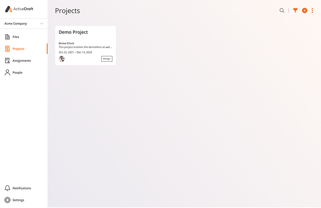

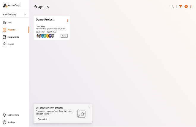
For half of the main pages, the empty states didn’t appear because default content, like a demo project, was automatically added to new workspaces. This meant that users never saw the guidance on what was intended to be empty state pages, which contributed to them feeling lost.
We were using empty states as educational guidance for users, but this use case had multiple drawbacks. My new solution would need to fit the following criteria:
All users should receive educational guidance. Currently, only the first user in a workspace sees the empty state, as they are most likely to add content before other collaborators join.
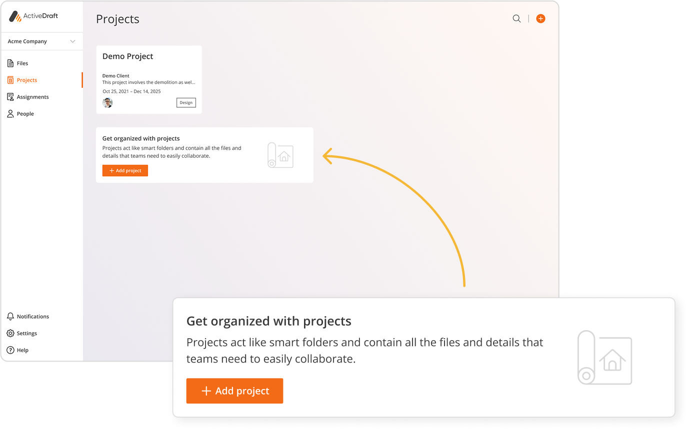
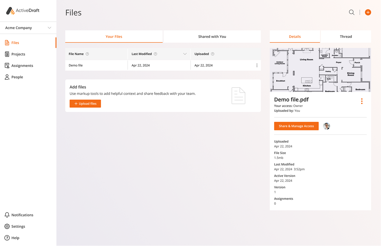
Pages would include demo cards. We found that adding demo projects increased usage, so by default, ActiveDraft pages would have content.
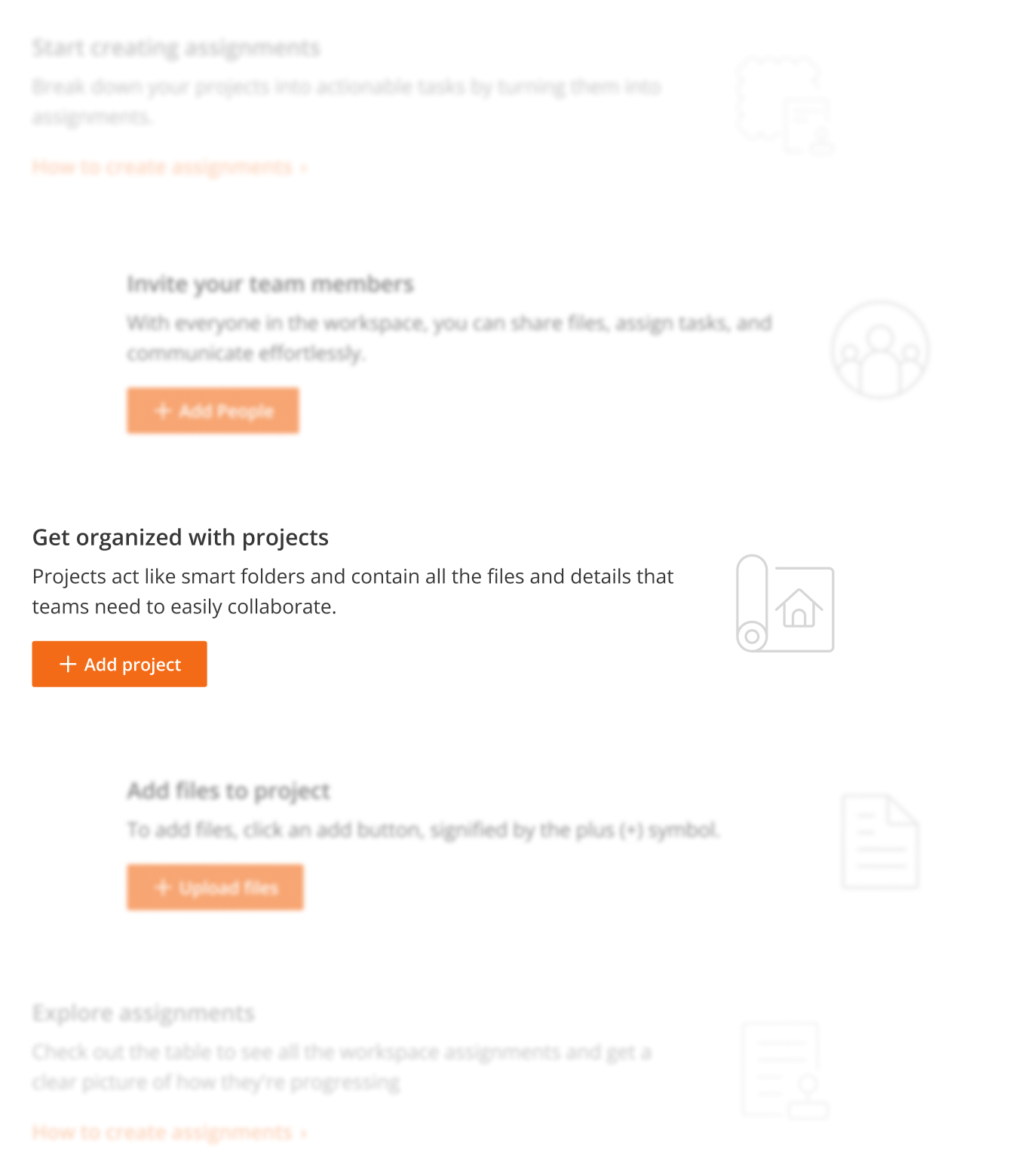
Make key actions discoverable and faster. My goal was to increase product usage by making page actions more noticeable.

The idea started as callouts containing hints that would introduce the page and prompt users to initiate key actions. I explored design options and placement of the new component. I then moved forward with banner hint option as it placed the call to action message higher in page hierarchy.
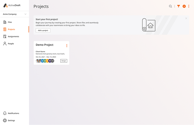
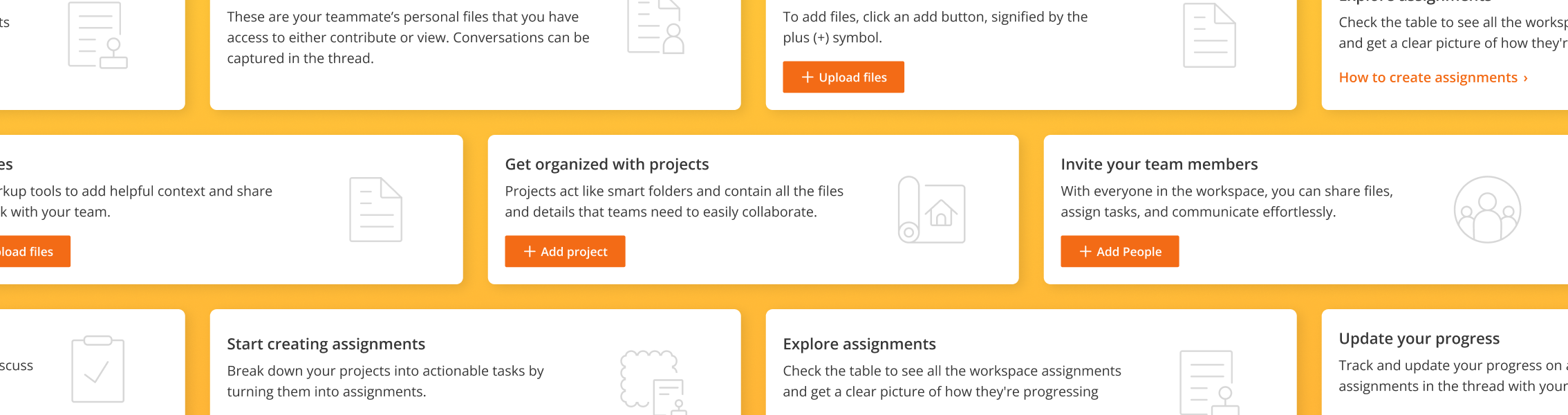
I introduced an educational banner that prompts users with encouraging and actionable guidance on each page and tab. Previously, users felt dropped into a sparse, contextless document management interface, which resulted in confusion and low engagement.
The most challenging aspect was crafting the UX copy for each banner as it needed to provide a brief explanation while prompting users to take action. The design is also straightforward to ensure the development team could deliver the new component on time for launch.


Post-launch, ActiveDraft saw a 181% increase in file uploads and a 352% growth in average session duration, indicating a significantly improved first-time user experience and deeper product engagement. Users preferred adding files through the new banner call to action button compared to the page’s top right hand corner add button.
Advocating for a feature. Getting this feature prioritized as part of the relaunch was a personal win for me. I was adamant about socializing the benefits of first-time user guidance during our product meetings. Our VP of Product agreed it was crucial, as it supported our self-serve product structure. It was incorporated within the next sprint.
Avoiding feature misalignments. I discovered that some empty states didn’t appear because our developers were directly asked to add default content to the page. No one stopped to consider the unintended consequences this seemingly simple request could have. At a small start-up, it can be hard to catch, but it underlines the importance of considering the entire flow when adding a feature.